In the continually evolving world of interior design, color trends play a huge role in shaping the look and feel of homes. In 2025, a fresh palette of colors has made its mark, bringing warmth, creativity, and a sense of calm to interior spaces. Whether you’re planning a complete home makeover or just want to refresh a room, these are the hues you should consider according to these major paint companies.
Pantone — Mocha Mouse
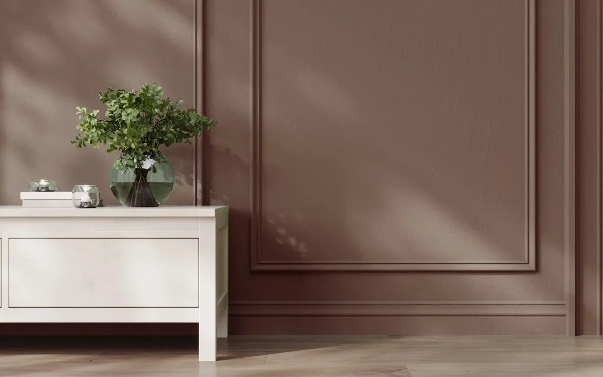
Mocha Mouse (17-1230) is a warm, rich brown that evokes comforting elements like coffee and chocolate. This sophisticated yet unpretentious hue embodies thoughtful indulgence and is expected to influence not only the fashion world but also the interior design community. It can stand alone or work as a strong foundation.
Consider pairing this hue with cornflower blue, rose tan, or creamy gardenia.
Benjamin Moore — Cinnamon Slate
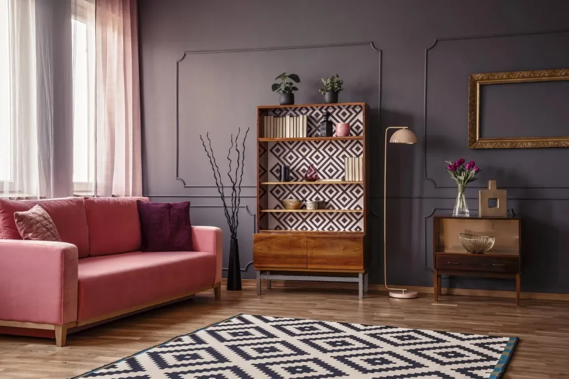
Cinnamon Slate (2113-40) delicately blends heathered plum and velvety brown and brings smooth familiarity to any design. This quietly colorful hue complements various styles and can be used in one room or throughout the entire home. It’s perfect for those who love to feel warm, comforted, and at ease.
Cinnamon Slate complements many colors; consider pairing it with sea salt, leather saddle brown, stained glass, or rose pine.
Valspar — Encore
Encore (8003-45G) is a rich, deep blue shade that works as an anchor, embodying consistency and confidence and creating a joyful respite. It reflects a continued appreciation for blue tones in design, offering a sense of depth and stability. This shade pairs well with lavender or sage.

Glidden — Purple Basil
Purple Basil (PPG1046-7) is a rich, earthy hue that brings a sophisticated pop of color to various spaces and a blend of warmth and energy. This shade encourages bold colors in home decor and adds depth and interest to any room. Consider pairing this color with the hues stony creek, sterling silver, or honey graham.
Beher — Rumors
Rumors (MQ1-15) is a deep ruby red hue that allows you to make a bold statement. Use it for interior walls, furniture, doors, or baseboards, or pair it with warm- or cool-toned hues, such as frosted jade, black sapphire, or colorful leaves.
Dutch Boy — Mapped Blue
Mapped blue (429-5DB) is a beautiful, medium-toned blue with subtle yellow undertones. It sets a timeless foundation in your home, allowing you to stay on-trend no matter what year. It allows you to balance comfort and luxury, create a space that encourages you to slow down, or design a joyful home. Pair this color with timber, white, smoked copper, or midnight bliss.
Sherwin-Williams — Color Capsule
Sherwin-Williams celebrated its 15th Color of the Year anniversary this year by introducing a color capsule featuring nine complementary shades:
Grounded (6089) — This rich color envelops spaces in comfort and gives you a sense of calm. It also provides you with stability because of its earthy tone.
Sunbleached (9585) — This shade is a balance between warm and cool and white and gray. It’s a great neutral that can adapt to any style.
Chartreuse (0073) — This historic color brings a tropical, joyful brightness to any room. It is both eclectic and versatile.
Rain Cloud (9639) — This stormy, gray-blue shade is both contemporary and classic.
Clove (9605) — This deep brown hue is almost black in richness, providing comfort and coziness.
Malabar (9110) — This sandy beige neutral is perfect for any room you want to turn into a soft, inviting haven. Pair this shade with warm hues to create a serene environment.
Bosc Pear (6390) — This golden hue takes a room back in time and provides an organic feel.
White Snow (9541) — This pure white is a favorite among designers because it makes a room feel light and spacious.
Mauve Finery (6282) — This subdued, sophisticated hue refreshes a room while providing the beauty of botanicals.
What’s Out in 2025?
Color trends that have taken a back seat when it comes to home design include:
Cool-Toned Grays — Homeowners are opting for warmer hues or fresher cool tones.
Overly Bright Neons — Designers prefer more natural, grounding palettes.
All-White Rooms — Homeowners are opting for layered neutrals that provide warmth and texture.

Don’t Be Afraid to Express Yourself Through Color
Paint companies’ 2025 color picks reflect a growing desire for comfort, nature, warmth, and personal expression. Whether you’re drawn to earthy greens, warm browns, or soft blues, this year’s palette has something for every style. Whether you want to start small with accent pieces or go bold with a new wall color, do what will help you feel grounded, welcomed, and uniquely you.
